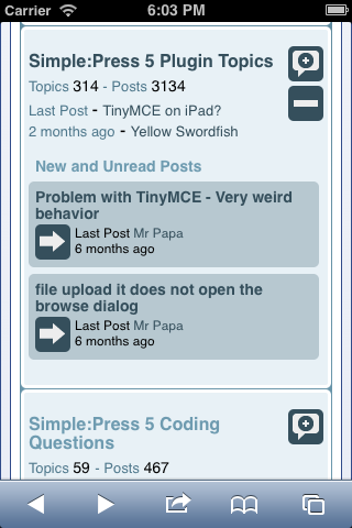
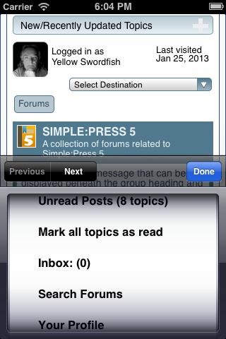
The following shots – taken from an iPhone 4 – show just a small handful of the different views supported by Simple:Press that have been re-engineered to display more comfortably on a mobile device. Starting over on the right with the ‘front’ forum page – the Group View. By default, we have cut things down to minimum information, removed unnecessary icons and images – and added some features we hope will aid the mobile user – like the dedicated new and unread post list that can be opened up right inside the forum row as shown.
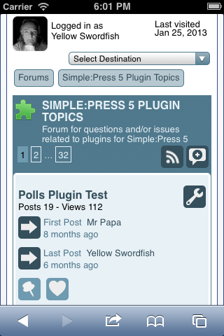
The same principles have been adopted here by trimming down the display to the real important information and removing some of the ‘fluff’!
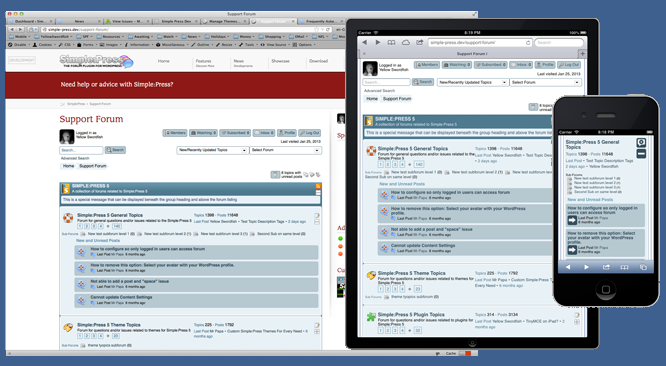
One piece of good news here is that this particular theme – being displayed in just one of what will eventually be a larger gallery of colour overlays – can also be used on desktop and tablet devices where it will continue to display much like our current ‘default’ theme. This is achieved in part by using, for some display tasks, more responsive CSS – but also by careful use of arguments being passed into our template functions. And where the functions are lacking flexible enough display options – they are being extended as needed.
See the image right at the bottom for screen shots of my desktop, my iPad and an iPhone all using the same theme.
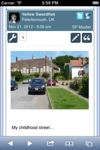
Here I have shown a very simple post with just an image and simple line of text. Once again you will notice that the area has been minimised compared to the full desktop view. But that does not mean the mobile display will be limited to just these components. Just like the desktop this is fully theme driven so customisation is just as easy and available as today.
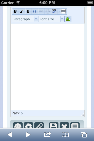
Now we have moved to using the built-in, WordPress provided instance of TinyMCE, we are also making use of the decision that WP makes on whether it should be available on a mobile. And here – at least on an iPhone – WP thinks it should be! It also thinks it should be available on my Android phone as well and in the next update on this subject I will include some screen shots taken using my Samsung Galaxy.
So – where are we up to with all of this and what still needs to be done before we can make this first mobile theme available?
Essentially – all of the main views are engineered with the exception, of course, of honing the styles where necessary and tinkering with the font sizes etc. The real big tasks that still lay ahead are converting those plugins that need extra mobile support – in particular the more major plugins like Private Messaging and Tags.
So these are next in the list to be tackled.
We hope – of course – that you may like what you see here and feel free to drop a comment in the forums if you have any to make. And at some stage in the hopefully not to distant future some of you may like to help us beta test the theme – bit more on that nearer the time.