Support Forum

Simple:Press New Theme

MP Mr Papa
Mr Papa
Member

Hope to start working new theme this weekend…  will use this topic for discussion and posting of screenies…

22 Answers

New Answer

MP Mr Papa
Mr Papa
Member

okay, spent 2 or 3 hours this morning whipping out a front page design with builder…   wasted the first hour or so trying to do fluid width – not really designed for that…  switched over to fixed width and was rocking and rolling…

anyways, first cut – didnt spend much time with typography…  comments welcome!

YS Yellow Swordfish
Yellow Swordfish
Member

Advertising? – ie., the text link ads

Are you wanting to retain the rolling slideshow?

For my taste the blue is a little too light…

MP Mr Papa
Mr Papa
Member

was going to evaluate where to put the text links… 

hmmm.. thought we like the blue from executive?  its that background image – thought you used it too…

rolling slideshow?  you mean the rotating images on front page…  dont have strong preference either way…   can simply install a fixed image there if you have one in mind…

MP Mr Papa
Mr Papa
Member

ah, see you mock up didnt actually use the executive colors, but a slight mod…  have replaced the heade and footer background with the ones you had used…

MP Mr Papa
Mr Papa
Member

and now with the text links in there… hopefully not too obtrusive…

MP Mr Papa
Mr Papa
Member

so let me know if this is even down the right or acceptable path…  going shut down for a while now and play some family boardgames…

YS Yellow Swordfish
Yellow Swordfish
Member

Do you mean they would be happy with the text link ads like that? Wow – if so, that makes it easier.

Yes to down the right path I think. A few minor things.

  • I think the grey band doesn't need to be so deep
  • i see you have discarded my thin grey band under the header that showed the page being displayed. No problem with that but one advantage it had was freeing the main header top right – again for ad space. Whereas now that area has buttons on it.
  • I think we need to drastically reduce the amount of text on the front page and get it bigger (but only on the front page)
  • And… I am tempted to get rid of the rotating slideshow (although we should retain donations and showcase – which will need fresh images)

By the way – what width are you settng this to?

MP Mr Papa
Mr Papa
Member

960px…

as I mentioned, have done nothing on typography…

not sure what you mean by deep grey band?  too dark? too tall?

easy enough to remove the rotating… just need a good image to do there…  the text is simple the page content, so again, we can easily change that…

oh, so you were putting something in that grey banner except the icons??  didnt see that on the images…  I can certainly add that back in…  have to think how to get the page title there… can of course modify the page templates, but was hoping to minimize the number of files touched in the child theme…

I was hoping for a few more icons too (the twitter, rss ones)…  maybe a wiki one, a mantis one, a websvn one, etc…

when done with next boardgame, will have a play with adding in the icon row again…

might have to make the top header part taller if we want an add up there.. but it is a good place…

MP Mr Papa
Mr Papa
Member

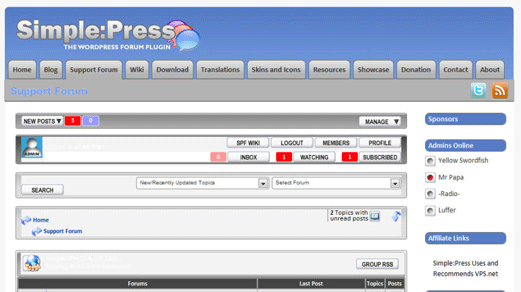
okay, three more screens showing different layout types…   front page, forum and other pages…  may want more eventually, but this gets me started…


so, let me know whether I should keep pressing or not…   assume I will if I have more time tonight…  want to start putting page content into the pages too which will cause issues until the upgrade is done, but oh well…

I will obviously want some typopgraphy help and images too…

when we have a 70% solution, I can commit to svn and we can press on, but will need to share db too until upgrade is done…

MP Mr Papa
Mr Papa
Member

btw… ignore the forum appearance… will have to tweak that up to… the dreaded table styles getting me…

YS Yellow Swordfish
Yellow Swordfish
Member

Deep Grey Band – Bottom

I meant that it maybe was too tall. But – is your intention to only show this on the front page? If that's the case then it is probably OK. I would think just the front page would do for that…

Grey Band Top

I like this (and you liked it too when I did it on my mockups). In the files I sent you there is a small function in the functions.php that will generate the title text dynamically so no need for changes to templates.

Grey Band Top – Icons

Whatever we need. Not sure about websvn although maybe some would find it useful but wiki and mantis OK… have to craft some icons I guess. What else is there? Maybe take some strain off the long menu – put 'Contact' and 'About' as icons…?

Icons, Graphics, Typography

I am standing by so as soon as I can have a copy (svn or otherwise) I can start work on those.

Image Location

One of the things I really disliked about  Builder was that it placed theme graphics in the WP uploads folder which makes it very hard to use svn for the theme. Can we avoid that?

Twitter

One of the things I do NOT like currently is the Twitter panel. I have no real objection to it being there but I think we show too much and the column is so narrow it starts to look very messy. This was one of the reasons I gave it a wider column. I don't know what the solution is to that but personally I would dislike having that the same as it is now.

Header and Footer

I had this stretching full display width which I rather liked. Do you not like that?

Translator 'Ads'/Links

Can we retain these somewhere? Don't have to be on every page. It is a small and friendly gesture to people who work hard to help but get little credit.

Forum Skin

We will have to decide which one to use….! Maybe Olata or Lifestyle? Actually Structure looks good and that is still probably the 'cleanest' one we have.

Moving Content to Pages

I can do my share of this of course. I would imagine we should be able t transfer that across pretty quickly when the time comes.

Fixed Width

Do we still need to stick to 960px? It must surely be quite a small minority that need this restriction now… although it does seem to be some sort of unspoken standard

LU Luffer
Luffer
Member

@Steve You asked for my input so here are some thoughts:

Firstly I'm liking the overall look, much cleaner and brighter than the current one. These are the things that don't appeal quite so much 🙂

Menu

The menu is a bit heavy, so many options it's a bit much for the eyes to take in. Can this be restructured and thinned out a bit? For example, could “Skins & Icons” be included in the “Download” area. Or even exapand the “Resources” section to include “Skins & Icons” and “Translations”?

Sidebars

Never been a fan of left & right sidebars so the content is squashed in the middle. Particularly on fixed width sites. Not so bad when there are two sidebars on the left or right, just not one either side.

Also on the subject of sidebars, the lack of any bounding box or background means things get confusing on the longer sidebars where content tends to blend in and there's no disctiction between where the sidebar ends and the content starts.

Grey bar (top)

Looks a bit odd, not sure how to explain what I mean. I just feel it's a bit detached, perhaps if it could be linked into the menu tabs some how so it ties in with them. Maybe remove the black line under the current tab button so it's integrated a bit more. I've added a photochop to explain what I mean a bit more. Obviously colour etc.. would need to be looked at, but it just brings that bar into the design a bit more. I only spent about 30 secs on it Laugh

Those are my initial thoughts anyway. Make of them what you will Cool

MP Mr Papa
Mr Papa
Member

I hope to thin out the nav menu too… going to give the new wp 3.0 menus a play and maybe use some dropdowns… thats currently just all our pages…

will give 2 sidebars a try like current and see which seems better… can explore differentiating techniques too, but these kind of simplistic, lacking borders, backgrounds, white space, etc seem to be the rage…

not sure how well the greys are coming out in the screenshot… looks better in real life… plus it was lightened a bit after posting the images… do want to play with a light blue or light blueish grey color up there too… or maybe Andy can make me an image background pattern…. 😉

and we certainly need a bunch of typography work, but that comes after layout…

MP Mr Papa
Mr Papa
Member

ooopsss.. missed andy's post…  will fill in those holes now…

yes, the grey band at bottom is only shown on the front page…  not sure how to make is shorter without removing or getting new artwork there…  It is a bitter tighter now than shown in the image, but not much…

top grey band I have working with titles now…  doesnt work well on forum pages though – gets too long and overruns…  I can take a look at your function and see what you did differently than the simple wp function call to get the page title…

Icons – I am going to play with a dropdown menu to remove the number up there…  so not sure on icons yet…

none of my images are stored in uploads… all are in images and subdirs in the theme directory…

translator ads? do you mean the friends of spf stuff?  no reason why that cannot be continued…

twitter – I actually like having that but then I use it a lot…  it is wider than current… can shorten… not sure how many others read it though (actually I dont read it on our page either)… so open for discussion..

I am just about done moving the content pages… worked that a bit last night…  I did make a decision to abandon the older translation and icons pages…  so icons/skins page is basically empty and is for 4.2.2…  4.3 will be out before the theme, so figured we would stick with just supporting those two…  same for translations which means the other site…

as I mentioned near the beginning, started down a fluid path but support for that in builder is not really there…  was running into all sorts of problems with the layouts…  was going to be too much work – at least using builder…  so yes, ended up ditching that and going back to the more standard 960px which is still larger than the average screen size that visits – which still amazes me… might be able to pla with header/footer expanding full width, but not sure that would look proper…

let me have a play with some of this today… maybe I can get it into svn for a closer look and to start in on the typography…   because of all the page changes that affect the db, I will have to send you a db to use too…  when we go live, will have to copy the individual page content up to the live site too…  still not sure how this will get live…  using a bunch of widgets for filling in areas…  likely will have to copy those manually up to the live site… that would mean taking the site down for an hour or two…  will have to look how that info is stored and see if it can just be db transferred…