Support Forum

Quoting uploaded pics with firefox

KV kvr28
kvr28
Member

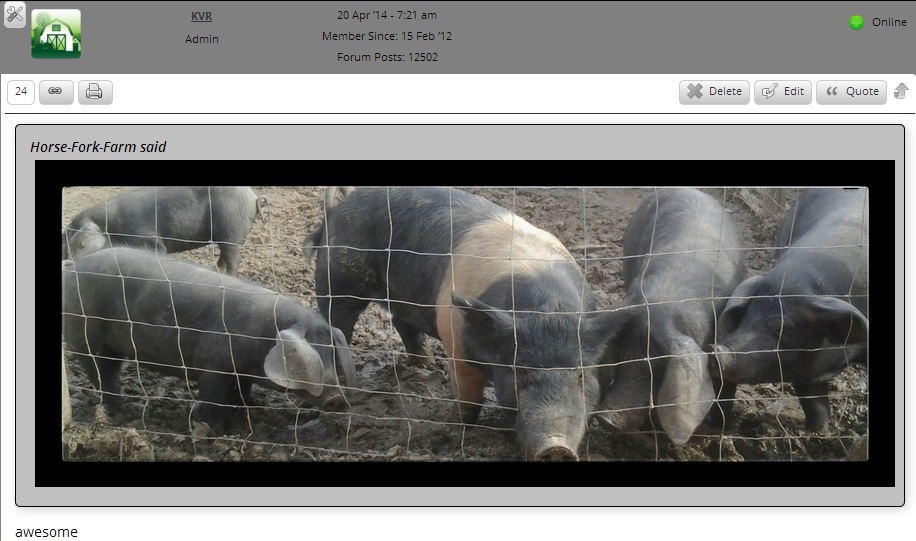
I was testing some of the changes on chrome and firefox and noticed that when a member quotes a post with a uploaded picture it looks fine in chrome

pigschrome.jpg


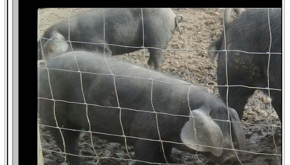
but when using firefox, the picture isn’t constrained to the forum area, it looks fine in the original uploaded post, just not the quote

pigsfirefox.jpg

any ideas?

4 Answers

New Answer

KV kvr28
kvr28
Member

I think I fixed part of the problem, I had the size constraints set to zero, so I changed max width to 600 and height to 400, so when quoting it sticks to that, but when you look on a mobile device with the firefox browser, it still overexpands, I checked with default android browser and it looks fine

MP Mr Papa
Mr Papa
Member

whether it rotates from landscape to portrait is a device operation, not a unified theme operation…

that said, unified does display a few things differently based on available width – always has – no real changes there…  and if talking about a phone, its going to be pretty much the same portrait or landscape…

for mobile devices, its usually best to set max width to 100% vice a fixed width…  and to keep it only happening for certain widths, use a media query in css… something like:

img {
     width: 600px;
}

@media screen and (max-width: 600px) {
    #spMainContainer img {
        width: 100%;
    }
}

that would set width to 600px unless you were on a device with width available less than 600px, it would just set the width to full viewport…   just an example, need to tailor for what you are doing… and may want max-width vice width… depends on what else is going on..

KV kvr28
kvr28
Member

Mr Papa said
whether it rotates from landscape to portrait is a device operation, not a unified theme operation…

that said, unified does display a few things differently based on available width – always has – no real changes there…  and if talking about a phone, its going to be pretty much the same portrait or landscape…

for mobile devices, its usually best to set max width to 100% vice a fixed width…  and to keep it only happening for certain widths, use a media query in css… something like:

img {
     width: 600px;
}

@media screen and (max-width: 600px) {
    #spMainContainer img {
        width: 100%;
    }
}

that would set width to 600px unless you were on a device with width available less than 600px, it would just set the width to full viewport…   just an example, need to tailor for what you are doing… and may want max-width vice width… depends on what else is going on..

I found the issue with the landscape issue, some reason the display settings on my phone changed, I will try that and see if it fixes the mobile issue, any idea why it only seems to be a problem with firefox?

I currently have this in my custom css for my theme

/* Simplepress mobile iframe width 100% for liveleak and youtube videos etc */
@media only screen and (max-width: 768px){
.spPostContent iframe { width: 100%; }
}

.spPostContent iframe {
max-width: 640px !important;
max-height: 360px !important;
}

that shouldn’t be causing any conflicts should it? Some members were noticing embedded videos were showing 4×3 so I added that to force 16×9

MP Mr Papa
Mr Papa
Member

the iframe stuff? shouldnt… unless the images are in an iframe, which we dont do…