Support Forum
 Offline
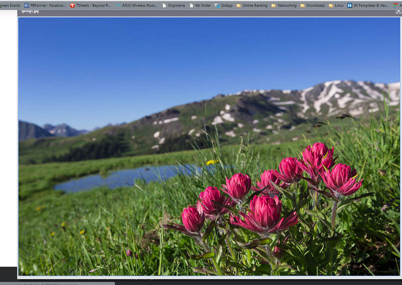
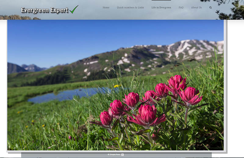
Hi guys, I have an issue with popup image enlargement. When I open the picture I can't close it because the heather/menu covers close button. When I click on the window it opens new tab in the browser.
Is there any way to control that. It would be nice to close the picture when I click on popup window rather than X that is currently inaccessible in my theme for many pictures..
Any suggestions?
Thank you. Charles
wow. why are you allowing such a bit image? on forum - options - content settings, are you constraining the popup image to fit within the window? would suggest so...
and afraid the only option for clicking on the image currently is to load the image in another tab/window...
but you can also hit the escape key to close the popup window (standard operation)...
Visit Cruise Talk Central and Mr Papa's World
 Offline
Actually I use constraining the popup image to fit within the window but as I was playing with settings I forgot to turn it on..
Even when I use constraining the popup image it's partially covered by browser.
Any way to make ?
1. popup window smaller
2. give popup window higher priority to be on the top so it's not covered as shown on the picture?
To answer your question storage is cheap and photographers like to details in the picture. So why not big pictures. 🙂
To answer your question storage is cheap and photographers like to details in the picture. So why not big pictures.
having pictures bigger than the screen window is just a bad experience... you lose the heart and soul of the image if you have to scroll up/down and left/right just to see parts of it - you never see the whole image together... making large resolution images for download is great - quite useful if you want to print, crop, etc... but not viewing on monitor...
whats the difference between the two pics? the second appears to be a simple z index issue and easily solvable... but not sure what is putting out the extra bar in first... is that browser stuff? which browser? not good if its not represented properly by the browser (or add on) in the window size calculation...
to solve the z index issue just next to make the popup z index have priority of the other nav menu header... cant tell you how from a picture, but easy to do from a link with example (have to inspect the css)...
you can limit the size of images on forum - components - uploads, but that is probably not what you want if you want full resolution images available...
but afraid there is no way to specify the size of the popup... it just displays at full size with a max of the available window screen size... depending on what the first image shows, this could be the first report of the window size stuff not working (its browser and js at work)...
Visit Cruise Talk Central and Mr Papa's World
 Offline
having pictures bigger than the screen window is just a bad experience…
We all don't have same size screen, do we?
It's always going to be big for some screens. I don't think solution to this problem is to offer picture size that matches smallest screen. It should work with any size of the picture. Don't you agree?
That's why we have popup windows that will show appropriate size on screen. Picture 1024x768 will look great for some and will look small on my screen (2560x1440). I think it's legitimate reason to offer higher resolution for everyone.
I am not using anything special...
1. In first image it is Chrome browser and their standard bookmark bar that is covering half of the X button. I lot of people use Chrome.
2. On second image if I use sticky header, that is my preferred option, the header will stay in place on top of the screen when scrolling. The header is always covering the close button. Not everyone will think of hitting esc key. Most people will click on the picture again thinking it will close.
I think it should work with any size of the picture not just with picture that are smaller size than screen. I am just trying to bring up my experience that is not really that good when trying to view pictures.
When tap on picture on my andriod phone Samsung I think it's S4 or S5 popup window will show up but I can't close it by taping on X. It just doesn't do anything. I'll try on my phone later...
I just think it should be be much smoother experience for people.
Thank you. Charles
 Offline
Well I wont get into a discussion on huge images in forums... It's your bandwidth and your site performance and nothing to do with me 🙂
The first issue - the Chrome bookmark bar is not something you can really do anything about as far as I am aware. I believe it is actually more of a Chrome problem. And I use Chrome myself. We grab the available window viewport size and have to believe what the browser tells us it is. Looks to me like Chrome is telling us the viewport size but not taking off the space needed for the bar at the top. It is, I believe, not possible to display over the top of that bar.
The second issue is, as Mr Papa said, a matter of the z-indexing. Your WordPress theme with that particular banner at the top is being somewhat greedy in defining the z-index for itself so the popup dialog needs to go higher than it is set to. This means changing the z-index in your SP theme for the .ui-dialog class. It is probably set at 10. Seems to me that setting it to 99999 should fix it.
As always we recommend the use of a child theme to ensure changes are not lost when upgrading. There are now Child Theme Frameworks available to download for all of our themes to make this simple and full and extensive details can be found on our Codex - Creating a Child Theme page: https://simple-press.com/docum.....ild-theme/
I sometimes have a little difficulty getting the close button to work on phones as well. I am afraid for that we are at the mercy of the jQuery UI team and hopefully they will find ways to improve that in future releases.
 |
YELLOW
SWORDFISH
|
1 Guest(s)
 Support Forum


 All RSS