Support Forum
 Offline
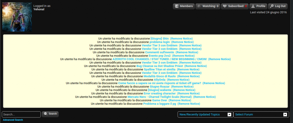
What white box? Do you mean the list of notices? if so then ALL of those have a 'remove notice' link beside them so they can be deleted after being read. Some may be able to not be shown in the first place but as they are not in a language I speak I am unsure what they all say. If you can tell me that I can let you know.
How are settings unfriendly please? Each section has a help button explaining what it does. There is a task list button at the top of each admin panel that can help you find what you need. And for most, spending a few minutes looking through the various settings can inform what each one does and how. Please can you explain 'unfriendly' and offer advice and your opinion on how you believe it could be improved?
 |
YELLOW
SWORDFISH
|
 Offline
Do you mean the list of notices? -> yes, that list. I know there's a link to remove them on right, but i would remove the whole panel if possible. I don't need them and after few minutes new notices appears.
Is it possible?
About settings, would be nice to better categoryze them, such as SMF / phpbb do. Maybe it's just an habit . If i'll have some ideas to improve them i'll explain you ofc.
Owever, just an opinion. Nevermind 🙂
1 Guest(s)
 Support Forum


 All RSS