Support Forum
 Offline
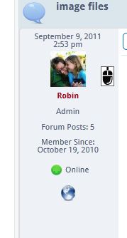
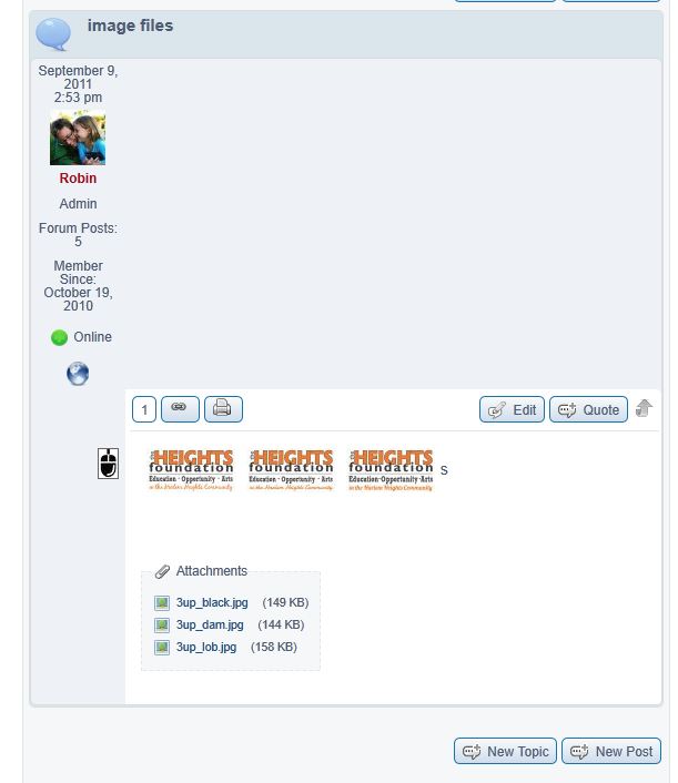
I uploaded a couple images to a topic and on that topic, a funny mouse icon pops up next to my gravatar (screen shot attached). If I click it, a lighbox of the first image pops up. Not sure if the icon is supposed to be there or not. If it is expected, would it be possible to have multiple images accessible through the lightbox by using the arrow keys, like a WP gallery?
Also, when I click the image thumbnails, the lightbox is popping up partly off the screen, off and down to the right. I can drag it to be centered, but any of the thumbnails (or the funny mouse icon) respond the same way when I click on them.
 Offline
Now that 'mouse' icon should display as your image does above - in other words just inside of the top right hand corner.
This probably mean there is some CSS leakage from your Wp theme effecting it and we will need to diagnose what we need to do to counter that.
Is there any chance you could quickly look at your topic using the Wp default theme to see if that places the icon correctly? And also places the popup image in the centre as it should?
And - no gallery type s planned yet - not so easy - but with the new attachments list it might be possible to introduce this at some stage.
 |
YELLOW
SWORDFISH
|
 Offline
I activated the twenty eleven theme and it went worse, actually. Uploading a picture. (I have not touched this theme, it's up to date and straight out of the box). I can give you the dev site link if you want to see it in person and look at the code. It's on the Genesis framework.
 Offline
I don't see anything obvious or anything external to SP effecting the positioning. Which is curious.
The only thing I can think of is that it an accumulation of the three images being side by side like that. Would you be willing to try a post with a single image and perhaps one with the images stacked on top of each other...?
 |
YELLOW
SWORDFISH
|
 Offline
I did a post with just one image, and also edited the OP to break the images into three separate <p></p>:
- The lightbox overlay works properly (centered in the screen).
- The mouse icon thingy is still over in the box with my gravatar, and on the post with the three now separated images, there are three of the mouse icons.
If it is a function of the images being side by side, that just happened when I uploaded all three at once--so maybe the uploader plugin needs to be tweaked to separate them automatically, if that's what's necessary? I prefer for them to be lined up, and love the lightbox overlay ($.02).
I'm still on build 7077; new build hasn't hit the WP updater yet (if you want to know).
 Offline
You can assume that--per instructions, I copied the iForum theme to a new folder so that I could start making some tweaks without them being overwritten, but I haven't hit the CSS yet. I have removed some lines from the spFoot.php file (like the timezone, and administrators), and started working with the breadcrumbs at the top a bit (I don't want the breadcrumbs to include the home page of the entire site), but that is all. Nothing else.
1 Guest(s)
 Support Forum


 All RSS