Support Forum
When I add images to posts I rarely get the subsequent texts in the right place, this annoys me no end ![]()
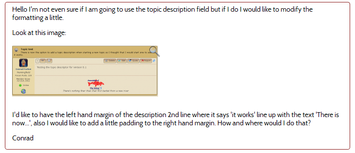
So the post preview plugin is one of the most eagerly awaited for me - but I still seem to be having the same problem. Look at the following preview from a recent post of mine on this forum.
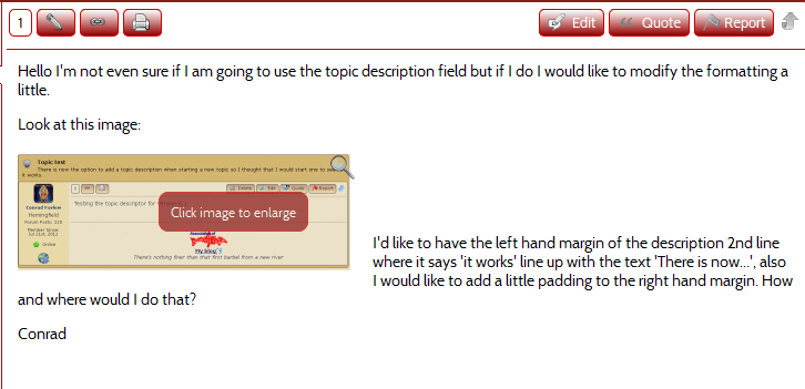
It looks fine and just how I want it. Now look at the actual post as a result of the edit:
They are not the same and surely they should be? Otherwise what is the point of the preview. I know how to get around the problem using the html editor as I have with this post but I'd rather not. Is there an easy way of avoiding these problems?
Conrad
 Offline
I can look into the 'float' issue with the preview as a separate conversation.
As to how to avoid getting your text mixed up with the floating image then all you need to do after inserting an image is press the enter key. This makes sure that the next paragraph starts beneath the floated image. This is pretty basic stuff.
I suppose there may be a lot of users who, like you, do not want to wrap text around images so it would be possible to add an option to the content display settings to force a new paragraph after every image. But that would then be a global setting.
 |
YELLOW
SWORDFISH
|
standard wysiwyg editing... but Andy has added a option to force the return for those who dont hit return... should be in next version...
and he is researching to see if he can duplicate your preview not matching issue... we did not see that in our testing before release... but hard to get our settings the same as all users...
Visit Cruise Talk Central and Mr Papa's World
One thing to keep in mind is your Default image style in the SP admin > Options - Content Settings.
If set to left, like it appears to be here, the image will float:left
If is an issue on your site try changing to middle or bottom and that should remove the float left and the text should not be to the right of the image.
1 Guest(s)
 Support Forum


 Custom Simple Press Themes
 All RSS