reboot, ff, child theme, same with reboot core
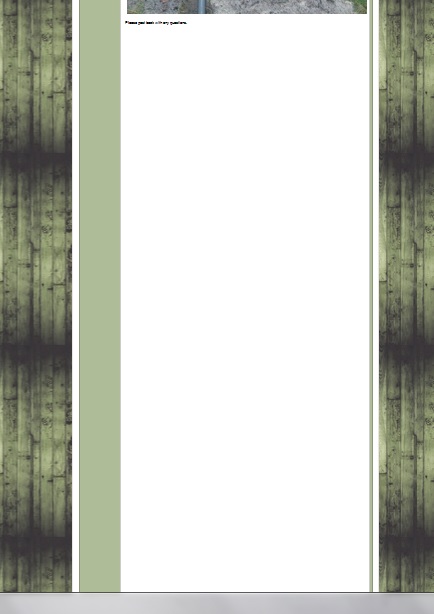
default theme, shades of grey, ff
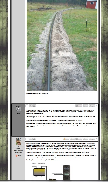


reboot, ff, child theme, same with reboot core
default theme, shades of grey, ff


the member posted several images in the thread which is linked above that is huge, here is a link to one of them
http://imagizer.imageshack.us/a/img266/5666/img20121013112808.jpg
it seems with reboot it looks fine horizontally but it is not adjusting spacing for vertical, the white spaces is where the height would be if the pictures rendered normally I believe
not sure if that makes sense

It just occurred to me that this could also be a result of flex-wrap – The same as the mobile problem you had yesterday. A quick test locally and it does seem to solve it, but I wouldn’t like to say for sure that it’s the answer without further tests.
You’re welcome to help if you like, just add:
#spMainContainer .spTopicPostSection .spPostSection {
flex-wrap: nowrap;
}
To the child stylesheet. In fact it would be really appreciated, run that and take a browse around a few topics, see if you notice any adverse effects!
Don’t speak too soon! Let me know if you spot anything, I will give it a good test run after dinner.

Not sure since it’s a very specific but rare problem, so far only reported here and not noticed by any of us or other users. Although it could just be down to an unnecessary flex-wrap rule – you put these things in with the best of intentions you know 🙂
Is this something that will be in the next update or should I just leave it in the child theme?
Well the change is in place and ticket in test – as long as we don’t find any knock on effects it will be included so keep in the child theme for now.
Hey Ike, just a heads up, that code seemed to fix the issue with youtube videos as well on pc, for some reason though it does not on ipad, it’s still cut off
OK Thanks for giving it a good test, and good to know about the YouTube videos.
Do you mean the YouTube videos specifically aren’t working on iPad? That could be down to browser specific rules. You could try adding this after the flex-wrap: nowrap; we put in place yesterday:
-webkit-flex-wrap: nowrap; /* Safari 6.1+ */
The videos are cut off like this which was happening across all devices, after thinking about it I was using safari and forgot to test with mercury, I’ll take a look with that