Support Forum
 Offline
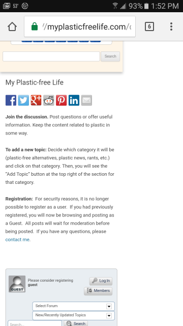
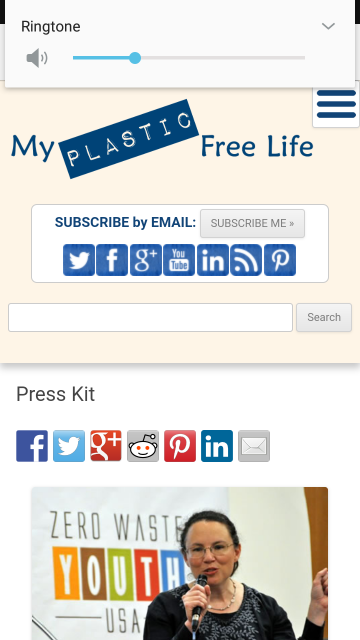
Hi. For some reason, Simple Press is showing up on my mobile phone (Samsung Galaxy J7) with a large amount of space to the right. I don't know what's causing it, but I do know that it must be related to Simple Press because all of my other Wordpress pages are showing up correctly. Attached are two screenshots: one of the Simple Press page and another of a regular Wordpress page on my phone.
Is there Simple Press CSS that could be causing this? And if so, what can I do to correct it?
My Simple Press page is at https://myplasticfreelife.com/discuss/
Thanks,
Beth Terry
 Offline
There can be many reasons. What SP theme are you using and is it one of our mobile responsive themes?
Also - how about the WordPress template being used to display the forum page? Is it the right one? Most usually you would be using a full-width template although providing the WP theme is responsive that should be OK.
The bottom line - to be frank - is that the forum will simply display to whatever width the WordPress theme gives it. It is the WP theme that dictates 100% what that width is.
But I will take . look in case I can spot anything.
 |
YELLOW
SWORDFISH
|
 Offline
No cant see anything. Something is forcing the page to a display width of 372px (at an average mobile phone sort of view). I see you are using the WP twenty-twelve. I just switched my test site to that theme and was not seeng the same problem.
But... the width the forum uses is - as I said above - dictated by the theme. The theme is already limiting the width available in the header text above the forum as you can see. Sp is just using what is made available.
But sorry to say I can not find what that is.
I would point out that you are not using one of our newer, responsive themes. Like this one we use here (Reboot) or Unified that was more like the old Default which you are using there. Or even the lighter BareBones that is free to download and use.
 |
YELLOW
SWORDFISH
|
 Offline
Hi. I just switched to Barebones and am having the same problem.
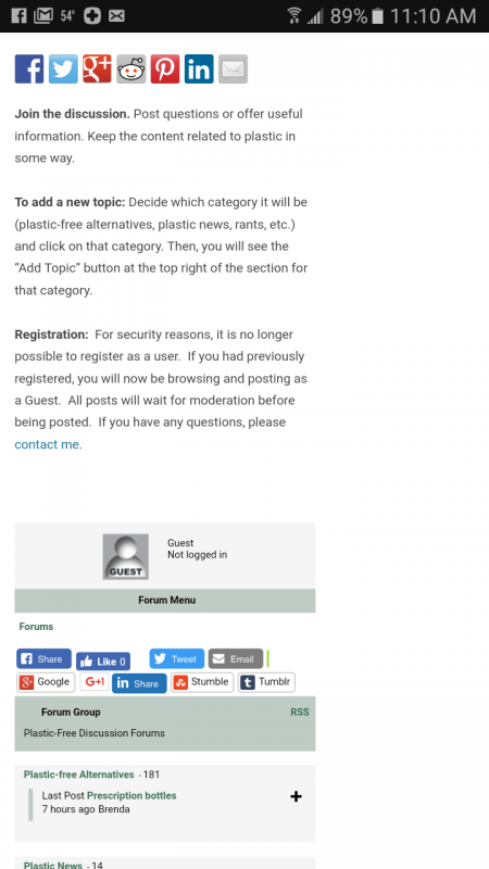
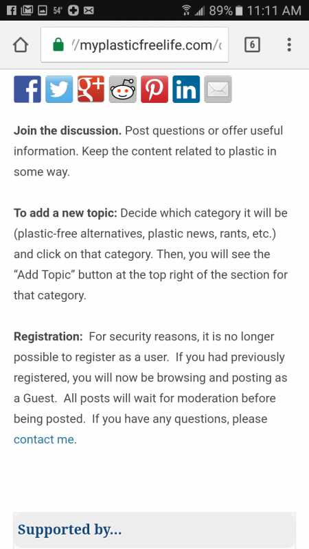
Here are a couple more screenshots from my mobile phone. One shows Barebones theme. The other is with Simple Press deactivated. As you can see, when I deactivate Simple Press, the page shows at 100% width without any problems.
Is there any Simple Press CSS that dictates the width of the forum? I just don't even know where to start.
 Offline
I have just rebuilt a new test - and used the twenty-twelve WP theme and the SP default theme - which I believe is exactly what you are using - and sorry to say but I still do not have the same problem.
To answer your question:
Is there any Simple Press CSS that dictates the width of the forum?
then the answer is yes - it is set to use 100% of the available width as I said yesterday.
for the sake of testing can you temporarily switch your WP theme to a newer one to see if that makes any difference?
 |
YELLOW
SWORDFISH
|
Not entirely sure what you are asking... If its how does the wp theme provide us the width to use, its via its theme css... in this case, the css here:
@media screen and (min-width: 800px)
.site-content-page {
 float: left;
 width: 78%;
}
assuming a screen width of 800px... the rest of the width is assigned for the sidebar...
If you mean how do we do the css to use 100% of that real estate provided to us via the wp theme, its in the simple press theme main css file for barebones:
#spMainContainer {
 font-size: 90%;
 width: 100%;
}
basically, the wp theme gives us the width to use for dipslay... then we allocate 100% of that width for the forum content....
hope that helps... if not, can you clarify what you are looking for?
Visit Cruise Talk Central and Mr Papa's World
 Offline
Ah great - the culprit has been found. Not sure how I missed that!
WordPress themes do have a bad habit of not actually allowing for a proper full width page so there is your answer - it sets it to 78% width.
I also apologise as I know now why it worked for me. I changed the '2012' CSS years ago for testing purposes and it has been like that ever since! So sorry about that.
 |
YELLOW
SWORDFISH
|
 Offline
This is so strange. I am using a 2012 child theme. Here is what is in my theme's css file:
.site-content,
.site-content-page,
.widget-area-1,
.widget-area-2,
.widget-area {
margin: 2% auto 0;
max-width: 95%;
padding: 0;
}
@media screen and (min-width: 800px) {
.site-content-page {
float: left;
width: 78%;
}
}
Those are the only two references for .site-content-page, and as you can see from the mobile screenshots I sent, the css works great for all other pages besides the forum page. For mobile devices, the site content is 95% of the page, and for screens over 800px, it is 78% of the page. But for some reason, when the forum is activated, that page is squeezing the entire page to what looks like 78%, including the header.
I tried changing the Barebones #spMainContainer width, by the way, and it just changed the width of the forum but not the rest of the page.
Something in the forum is causing my entire page to display incorrectly, and I don't know what it could be.
 Offline
I can only repeat that the forum is designed to fit into whatever space the WP theme allocates for the page content area. It uses:
#spMainContainer {
width: 100%;
}
where #spMainContainer is the main div the forum uses within whatever the theme defines for page content.
 |
YELLOW
SWORDFISH
|
1 Guest(s)
 Support Forum


 All RSS