Support Forum
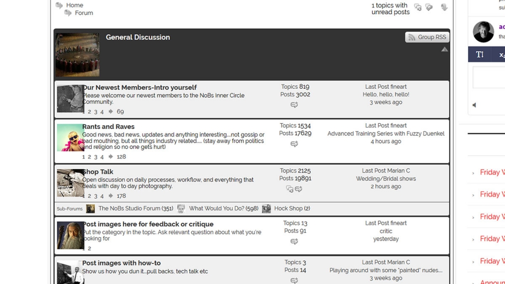
Question regardin custom icons bleeding onto text...
That would be because you made the icons larger than the default column width...
see this codex faq for help: https://simple-press.com/docum.....ach-other/
refers to a different column but concept is same... if you make wider icons, you need to widen the column for the icons...
Visit Cruise Talk Central and Mr Papa's World
good to hear... its really up to you what size you want to display and how it fits into the whole site display/width...
Visit Cruise Talk Central and Mr Papa's World
Forum Timezone: Europe/Stockholm
Most Users Ever Online: 1170
Currently Online:
Guest(s) 1
Currently Browsing this Page:
1 Guest(s)
1 Guest(s)
Top Posters:
Mr Papa: 19448
Ike: 2086
Brandon: 864
kvr28: 804
jim: 650
FidoSysop: 577
Conrad_Farlow: 531
Stefano Prete: 325
Carlos: 291
Member Stats:
Guest Posters: 621
Members: 17381
Moderators: 0
Admins: 4
Forum Stats:
Groups: 7
Forums: 17
Topics: 10146
Posts: 79674
 Support Forum
 Offline


 All RSS