Support Forum
 Offline
Hello community
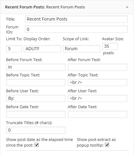
I wonder what is the configuration order and you have to show recent post plugin.
I mean, these options:
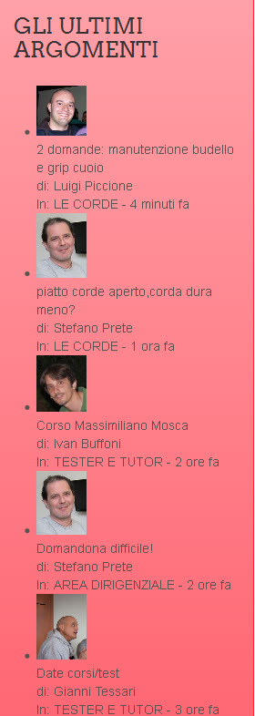
I would like the image is aligned like yours.
Similarly, I wonder if there is any other option to display more information on the forum at some WordPress widgets. Show the TOP most users commented, themes ... ultimately there some more information and not just the recent posts. Thanks in advance.
 Offline
Well it's pretty straight forward to get the results to show as we do here.
I have just knocked up locally a copy of the way it appears here, take a look at the options..
As you can see, you can use <br /> to separate the lines.
As for other widgets and what further options you can have, I don't believe there is a 'top posters' widget or 'themes', but have a look through the list.
Hope that helps ![]()
 Offline
Stefano,
In order to get rid of the bullet points, you're going to have to edit your theme file. If you inspect the element itself, it should show you what class it is- as every theme is different. I would have thought most themes will have the widget classes in style.css of the theme but some might not specify.
Looks to me like the class you want to modify would be
ul, ol {
padding: 0px;
margin: 0px 0px 10px 25px;
}
you're going to want to add a list-style:
ul, ol {
padding: 0px;
margin: 0px 0px 10px 25px;
list-style: none;
}
Although doing this doesn't limit the list-style: none; to just the widgets, but wherever an ordered or unordered list appears throughout the theme, so you might want to consider specifying a class or ID that the widget sits in.. It's hard to tell without being able to edit the stylesheet itself as there's only so much you can tell from using the inspector. 'module-surround' might be a good place to start, but using the inspector yourself you should be able to find the div's the widget sits in, and experiment to find the right one to use.
Unfortunately I'm not sure why the text is not sitting next to the avatar, it seems like for some reason the class .spAvatarTag looks like it's being stretched to 100% pushing the text down. I will look in to this one for you.
As for the topic title in bold, you can use HTML tags in the widget editor. For example try putting a '<b>' tag inside the 'Before Topic Text' box and see what the result is. Might take some re-jigging to get it how you want.
Hope this helps
 Offline
Ike, thank you very much!
The theme, unfortunately, is a bit of a mess...
It uses a compiled css file, no trace of what I am after...
I have been able to remove the dots and more.
By putting <b> inside the ‘Before Topic Text’ box and a </b> inside the ‘After Topic Text’ box, now the title is bold!
I am pretty happy.
If I can solve the problem of that stretching .spAvatarTag...
afraid we will have to wait for Ike tomorrow since the site link was only sent to him...
Visit Cruise Talk Central and Mr Papa's World
 Offline
Stefano,
Try adding
.spAvatarTag {
    float: left;
}
To your WordPress theme stylesheet. You might need some padding in there as well. maybe:
.spAvatarTag {
    float: left;
    padding: 0 5px 0 0;
}
From there, you should be able to also change the size, and or spacing of the text to the right to clean it up.
Hope that helps
1 Guest(s)
 Support Forum


 All RSS