

Hi guys,
I want to give some feedback about the paging in the forum and about some other things.
I am an experienced user when it comes to forums and all sorts of web applications but even I did not see the small numbers of the paging at first. So when I browsed one of the topics I started, I did not realize that there was another answer until I got an email that took me directly to it.
The reason why I didn’t see it by just looking at the thread is that the paging is so tiny. They can quickly be overlooked, especially by users who are not so used to complex interfaces like a forum. We have many of such users among our clients.
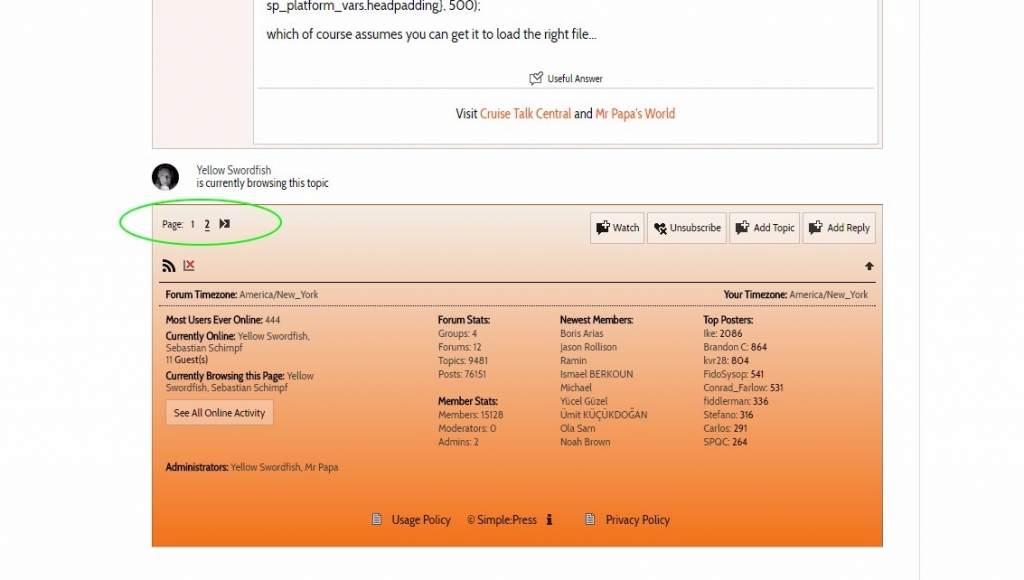
I am worried about those users. Some of them complain about the forum not being easy to use and not intuitive enough. Too many little icons, boxes, and buttons. When I look at the paging, I can understand why they are saying that.
The usability of the pagination could be easily improved.
You guys do a great job for the most part but the interface could really use a facelift and become more user-friendly. It seems a bit old-school to me.
Another thing I want to suggest is that you consider moving away from all these tiny image icons (most of them are not pretty anyway) and consider using Fontawesome or another similar solution for all the icons. This would also result in a better scalability. Right now all the little images look blurry when I scale the page.

